Kafe Kandinsky Case Study
Fall 2021
Client: Student Project
Challenge: The goal was to build a cafe brand with the influence of an important figure of our choosing. It was important to have consistency in the design that can be used in small to big materials.
Description: The solution was a cafe inspired by Wassily Kandinsky, who was an abstract artist. His paintings influenced the abstract elements, fonts, color palette, and logo designs.
Logos
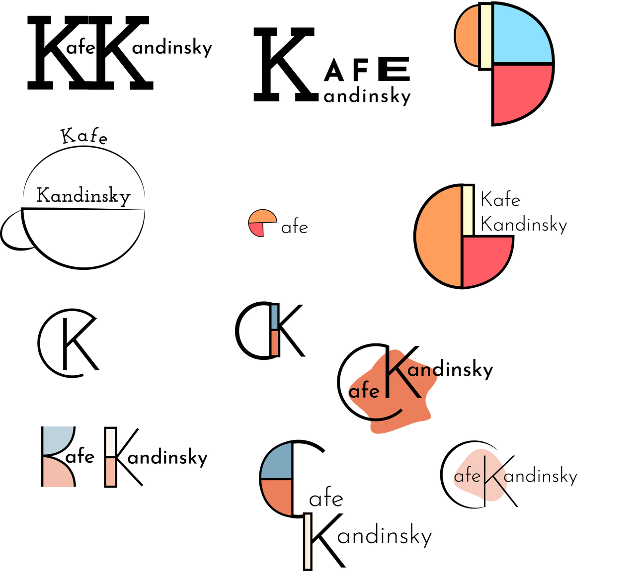
After designing a variety of potential logos, the final logo was inspired by the geometric shapes found in Kandinsky’s work called Upward. Taking those shapes, they helped create two different letterforms for the letter “K”. There are two versions of the logo with one including text and the other with just the two Ks overlapping as one.
Slogan & Color Palette
The slogan was kept short and simple while alluding to the fact that Kandinsky was an abstract artist.
Kandinsky’s paintings had a lot of shades of blue and off white, so they were incorporated into the brand’s color palette. Orange was used as a complimentary color for the blue.
Fonts
Josefine Slab and Sans were chosen because of the offset in the letter “e” to go along with the abstract theme. Work Sans was chosen for how well it fit with the other two fonts. Variations of font weights were used throughout the whole project.
Business System
This incorporates the letterhead, business card, and envelope.
Menu
The menu uses playful typography and abstract elements that help guide the viewer’s eyes throughout its entirety. The speciality item was emphasized through white space and font size.
Advertisements
Advertisements were created to garner attention for Kafe Kandinsky while delivering important information.
Collaterals
Collaterals were made in different forms that ranged from as small as a ball point pen to as big as a delivery van.


